Prepay Responsive. Web Design 2017

Prepay Web Responsive
This is the one of the project that I was involved in Verizon.
Original Web & mobile View
Challenge
The main challenge was that this project came directly from the developers. They built this application not from the UCD point of view, with confusing navigation and usability issues, problems with the style branding.
I was tasked to create a POV concept for the responsive design in a short time frame and to improve the main usability problems. The new design should match the existing mobile First App experiences and become the part of the myVerizon website.
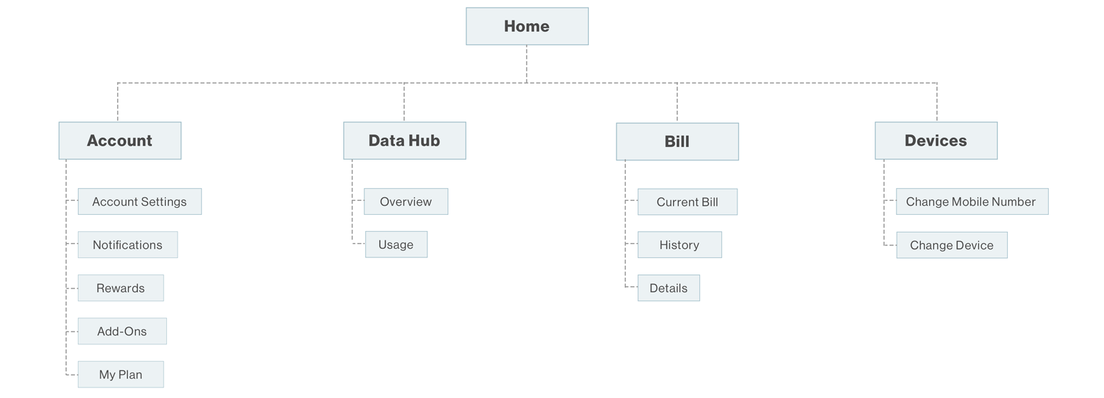
Information Architecture
In order to organize the navigation and match it with the mobile First App I decided to use the close card sorting techniques. In my opinion, the closed card sort works best if you are working with a pre-defined set of categories, and you want to learn how the users sort content items into each category.


An additional problem with the current navigation was that the users who use the mobile device to access this desktop application are not able to get back to the main myVerizon website unless they Sign Out. This situation was breaking the usability experiences.
Design
The company doesn’t use any wireframes on any stage of the projects. To create a right concept for the design I ran through 2 design stages to represent completely finished high-fidelity mockups.
The first design concept that I presented resolved many problems with the navigation and company style branding. Unfortunately, the close review and small internal user testing identified an additional problem with the design. The presented layout gave a feeling that this design did not belong to myVerizon Web, and felt as a part of the completely separate application.
Final Web Version
The second design concept was completely accepted: full screen layout, great navigation, logical user flow.
Mobile Version
To prevent the confusion with the mobile navigation and in order to allow the users to navigate the website without the need to Sign Out, I decided to use the existing company mobile navigation for the web view.
Result
This project is scheduled for the release in October 2017. Based on the provided requirements this POV design is going to cover all main problems with the navigation and usability in both Mobile and Web versions. In addition, the users while interacting with the application will find the familiarity with the Mobile Fist App.


