Chevron ExtraMile Extras. Mobile 2016

During this project, I worked as a UI/UX designer. My job was collaborating with customers and development team, created wireframes for iOS and Android, site map and visual mockups. Created presentation and present the mockups to customer product owner.
Overview/ Users
Chevron decided to increase the share of Total Market Heavy Users. Heavy users are the lifeblood of the convenience store category – they spend more, visit more and are more brand loyal – and tend to be Millennial males who habitually stop by as part of their daily routine. Many ExtraMile Heavy Users visiting 7-Eleven more often - perceiving ExtraMile as a secondary, “fill-in” convenience store option. The problem was the heavy convenience store users have incredibly low expectations. They’ve learned to settle with the lackluster offerings of the typical convenience store – largely defined by 7-Eleven. The ExtraMile app should create a routine that's more rewarding.
I was involved in this project in Wave 1. (No mobile payment involved)
ExtraMile (EM) App should help to increase engagement with users through a compelling mobile app with geo-location, language choices, mobile payment, and high-level store information.
Ideas behind this project were:
- Have a mobile digital platform (Sign up for loyalty program through the mobile app).
- Facilitate store experience. View EM promotions available in-store, base on geolocation.
- Locate store and products.
- Track rewards.
- Show our care. Provide a feedback.
Challenge
The customers have a strict requirement for the mobile app feel and look. The mobile app should look the same on both Android and iOS devices. The main problem with this project was an extremely short deadline. To increase my work speed and create wireframes within a very short period of time I utilized ninjamock.com, an online software for the wireframes creation. In addition, for fast prototyping and team collaboration I used Invision.
Site Map

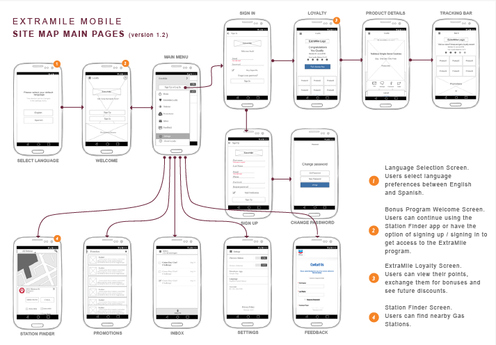
This is an initial site map, that I had created for this project.
Information Architect Problems
While working with the design process I faced a problem with the navigation. The design idea for the main navigation was to place it at the bottom of the mobile app for more modern look. Unfortunately, Android has a default navigation panel at the bottom. Even design should match for both platforms; the customers agreed to follow the Human guidelines for Android and to use standard hiding panel for the main menu.
As for the iOS version, I decided to place the navigation at the bottom.
iOS vs Android navigation

Design
This is the part of wireframes that I had created for this project.
iOS Wireframes

Android Wireframes

Visual Design
Our team and I were responsible for the visual design as well. During the wave 2 the Creative Agency got involved and provided the promotion materials and marketing images.
Results
The project was successfully launched the following year. It is available through both Google Play & Apple AppStore. The app has a rating of 4+ and more than 10 000 downloads.


